
Didriks Website Redesign
Didriks + Local Root is a Housewares and Kitchen Store based in Boston, MA with both a brick and mortar and e-commerce presence. After a bit of time working as their E-Commerce Content Manager, I spearheaded their website redesign project and simultaneously worked as the Project Manager, UX/UI Designer, and Content Manager.
Original Website Design

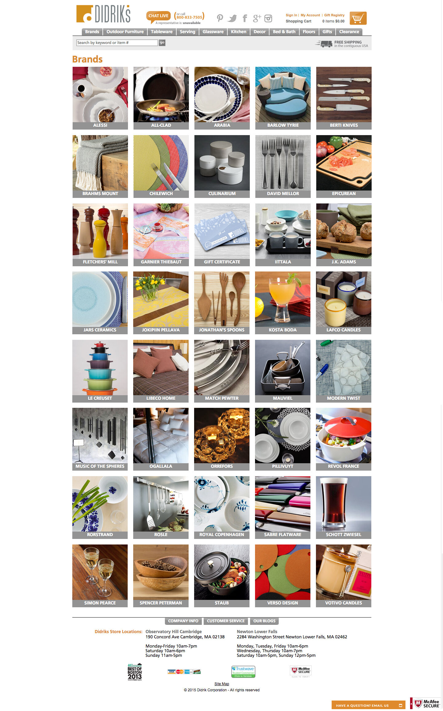
The original Didriks website, while functional and still selling products successfully, was feeling a bit dated. Running on an older Netsuite Sitebuilder platform, the Didriks team decided to make the move to Netsuite Suitecommerce Advanced, which added many features that needed to be built out. There were also a few existing problems that we needed to fix. Most importantly, on the old website it was quite hard to get to a product page to buy an item. On average for most of the commerce categories, it took over 6 clicks to reach an item page, which could be a big turn off for customers trying to get to the item they need. The category navigation was overly complicated, which could work for a knowledgeable customer who knows exactly what they need, but not for customers who were just browsing without an intended item in mind.

On most pages there was also a feeling of clutter as the images were often quite close together with no real cohesive image styling, as most images were from separate brands with very different styles. The design itself also looked a bit antiquated, which is not something you want to portray as a company who is selling high-end design. So, we needed to freshen it up and make it more modern. We wanted to start being able to appeal to a younger demographic, but also didn’t want to alienate older demographics by making it too foreign to them. On a similar note, our website was not mobile friendly, which was a major problem we had to tackle if we wanted to continue to be successful.


Planning + Wireframing


In the wire-framing and planning processes we first and foremost wanted to make things cleaner and clearer for the customer. We added more negative space to make the pages less cluttered feeling, and decided on having less, but larger, images. In our research we targeted a few key customer groups. The most important distinction was customers with knowledge of our products and customers without any knowledge. The site needed to appeal to, and make sense to, both groups simultaneously. The homepage needed to be more browse-able for a customer that came to the site without knowing exactly what they wanted, so we chose to make multiple large banners with less text.


For the Brands page, we wanted to give more info on each of the brands, for those who wanted to learn more, since Didriks highly values what brands they carry + the quality of them/their products. We kept the left hand navigation to easily travel between category levels, but cut down on the categories within so customers could reach item product pages faster. Both filtered search and wish-lists / favoriting items were new capabilities for our platform so we had to integrate those features as well. We took these designs and based our mobile designs off of them with a few tweaks to smaller screen formatting for ease of use.


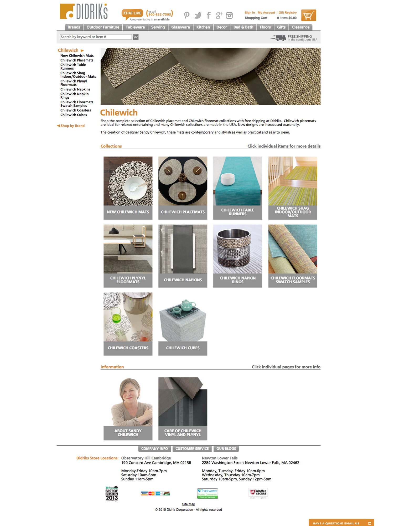
Final Designs


The final designs came into fruition once we picked a dynamic color palette and chose a fitting font. We did have some roadblocks, but our development team guided us through what was feasible with the designs and we altered them to fit what was in the realm of possibility for our budget and current platform. After seeing the completed designs, we additionally tweaked some of the features to help guide the users, such as “New” badges on new items and matrix subitems, as well as being able to sort by “New”.


Before the site launch was completed, there was also a host of backend data to add/correct; including adding 20+ navigational filters to all 10,000+ items, creating new and re-assigning categories, implementing new naming conventions for every item, as well as new banner images for each category. I personally was responsible for directing and managing all of this backend work for a small team of myself and two others.


Going Forward
The website will always be a work in progress as we continue to improve the user experience and add new features. For instance we’ve recently implemented Yotpo which provides shoppable image galleries, and the ability to review and ask questions about items. We continue to overhaul every category to improve overall shop-ability, as there are still older items and categories not quite up to our new standards.
Cohesive photography is imperative in moving forward to create a seamless experience when browsing the site, as it creates less distraction + allows us to combine our many brands together - an experience only Didriks can uniquely provide.
As with most projects, we are also bound to some extent by the capability of our platform as well as budget, but overall the site as a whole is now more fluid and accessible to all types of users and we will continue to enhance and develop the user experience. Feel free to browse the whole site as it currently stands here.